

September Walk – Scrapbook Layout
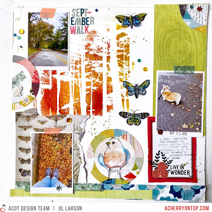
When I created this 12×12 page, I had a few ideas in mind. I knew I wanted to capture that moment in early fall when there is still plenty of green, but the leaves are just beginning to gather and blow around at the sides of the road, when the sky is overcast one moment and blue the next, and when it’s become chilly enough for my dog to really enjoy walks again (she hates these outings when it’s too warm!). I also knew that I wanted a mixed-media background with stencils, stamps, and colored pencils. My color palette would include rich autumnal tones but also green.
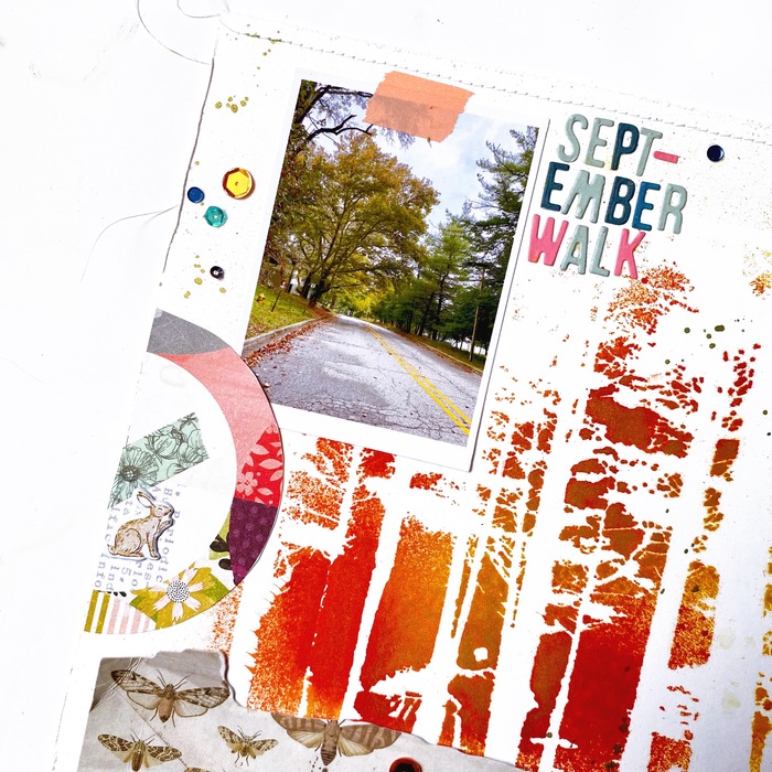
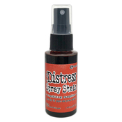
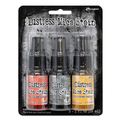
What resulted included all of this, but I was surprised that it turned out, design-wise, looking a bit like a vision board (or even a bulletin board!) on which I had taped a few snapshots. I didn’t need my photos to be the focus this time. Instead, they contribute to the late-September mood I wanted to capture, as does my stencil of trees, which I sprayed with Distress ink in Crackling Campfire and Distress mica stain, and my moths, bird, and bunny.
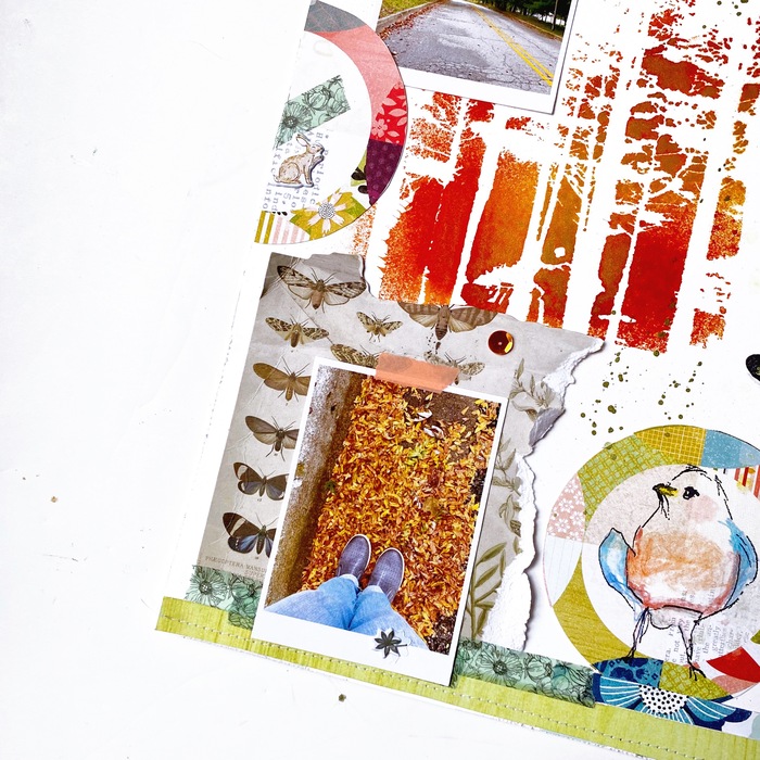
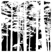
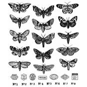
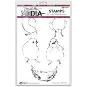
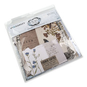
The Crafter’s Workshop stenciled image was my starting point for the background. I then chose Vicki Boutin’s green woodgrain paper from Print Shop to cover another portion of the background. After I stamped the moths from the Tim Holtz Moth Study set, I knew the 49 and Market Vintage Artistry Serenity collage piece would work well in the opposite corner, especially since I wanted to bring in gray as my neutral given that it’s a prominent color in my photos. I cut circles (or partial circles) from the Print Shop Circle Time paper, stamping a Dina Wakley bird in the full circle at the bottom, and positioning the other pieces around the layout. “Live in Wonder” was the perfect sentiment to accompany my journaling, so I chose that card from the Print Shop cut-apart sheet.
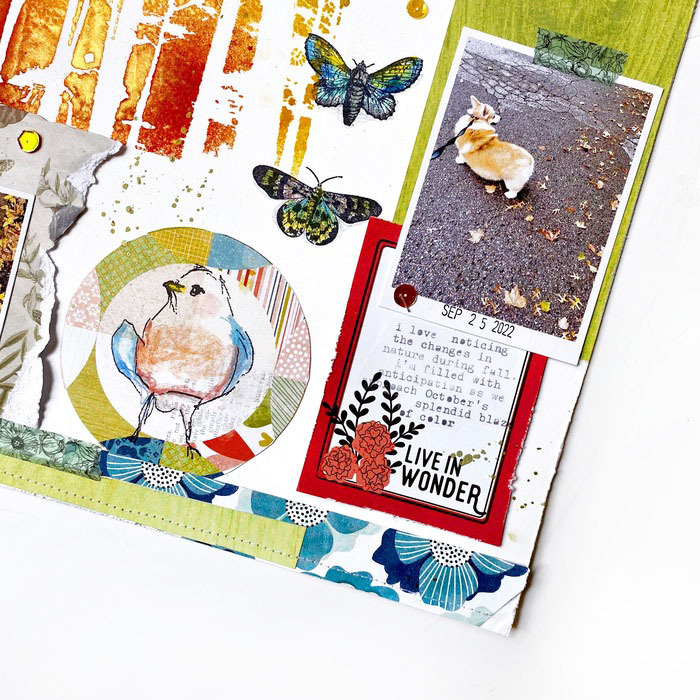
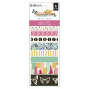

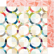
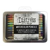
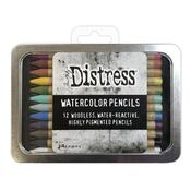
When coloring my stamped images, I reached for the new Tim Holtz watercolor pencils. I chose a range of blues to balance the warm colors on my background. I also included touches of green and yellow along with a little gray and pink. Similarly, I used blue for the bird’s feathers and rusty reds for its breast, and a little kitsch flamingo on the cheek. I could have made the colors more vibrant by adding water, but I decided to go for a softer, more scribbly look for this page. I continued the blues and greens in washi tape and a bit more patterned paper along the bottom edge. A little machine stitching for texture; a simple title of small, die-cut letters; a few sequins and puffy stickers; some ink splatter—and there we have it, a page about enjoying nature in Michigan at the end of September. I’m looking forward to each phase of autumn, a season that always goes way too quickly!
Jil Larson
Hello everyone, I’m Jil Larson, a new member of the design team. I’m excited to share my projects with you! I’ve been scrapbooking and art journaling for many years now. I first started memory keeping when my nieces (now in their 20s) were little girls and I was looking for a way to tell stories about them and the art they created. From there, my love for this wonderful hobby grew and developed. As a life-long diary and notebook lover, I’ve also recently been enjoying creative play in sketchbooks and journals.


