Type, words, titling, there are many different names. Basically type is words on your layout that does NOT include journaling. It could be a title, quote, the name of person/people in a picture, date, catch phrase, etc. All details worth capturing, BUT let's give you some tips to allow you to think outside the box, or change up your style.
#1. "Drop the Drop shadow" Sometimes simplicity is the best way to showcase type.

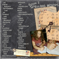
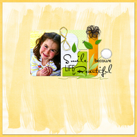
#2. "Size Matters" Change different words in a phrase by making some big and some small.
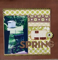
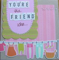
#3. "Make it Pop" Try to use contrasting colors. If your black ground is dark, use a light colored type, if it is light, use a dark color. See how you can read the type on these layouts below because they chose contrasting colors against their backgrounds.
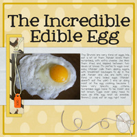
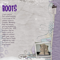
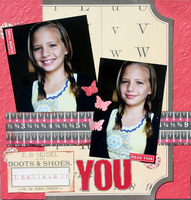
#4. "Mix it up" You don't have to follow what your 7th grade teacher drilled into your head. Have a proper noun start with a lower case letter. Maybe you want a dramatic look so you're going to use ALL CAPS!
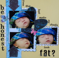
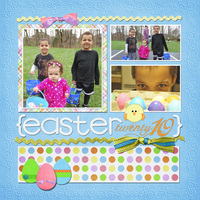
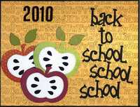
#5. "Break out of the box" (or maybe that 12x12 area) Allow letters to fall off the edge of the paper, cut a letter in half as it trails off to the side. It's a very graphic look, but don't let this trick run wild, if you get carried away no one will understand what you are trying to say

In my example I covered up the "y" in family, but you can still tell what the word is and how Cassandra's words trail off but you still know what they are.
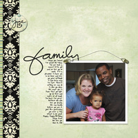
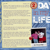
I hope you enjoyed my tips and tricks and try a new and creative way using your type on a future layout!
Thanks, Have a good day!
Hugs, Janell